
When it comes to a ‘good-looking’ report, as with art, you could say that beauty is in the eye of the beholder. Do you love a really big key metric with up or down arrow indicator? Are you a fan of a complex graph with multiple metrics and data labels?
Oh, the visualization choices:
- Area vs Line
- Bar vs Column
- Pie vs Donut
Report formats also have many options including dashboards, multi-paged presentation decks, detailed spreadsheets, executive summary articles, infographics, and more. In this post, we’ll dig in further to the art and science of a good dashboard.
While many aesthetic choices for a dashboard design can be subjective, here are some key elements of good reporting that we should consider.
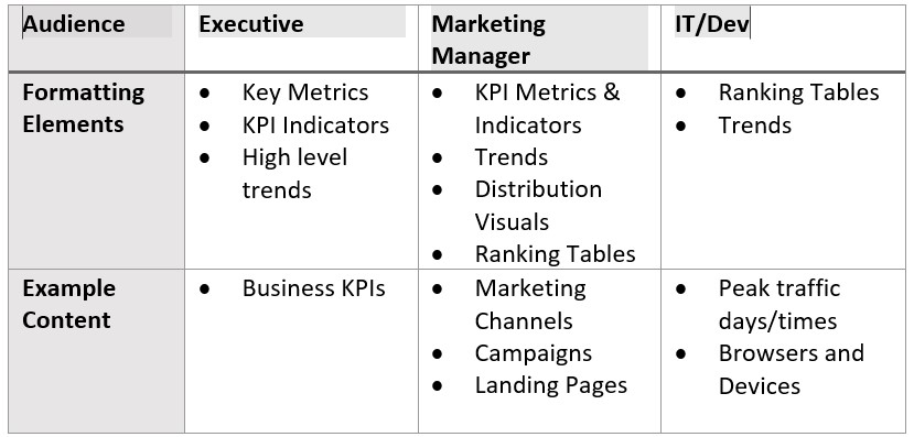
1. Audience
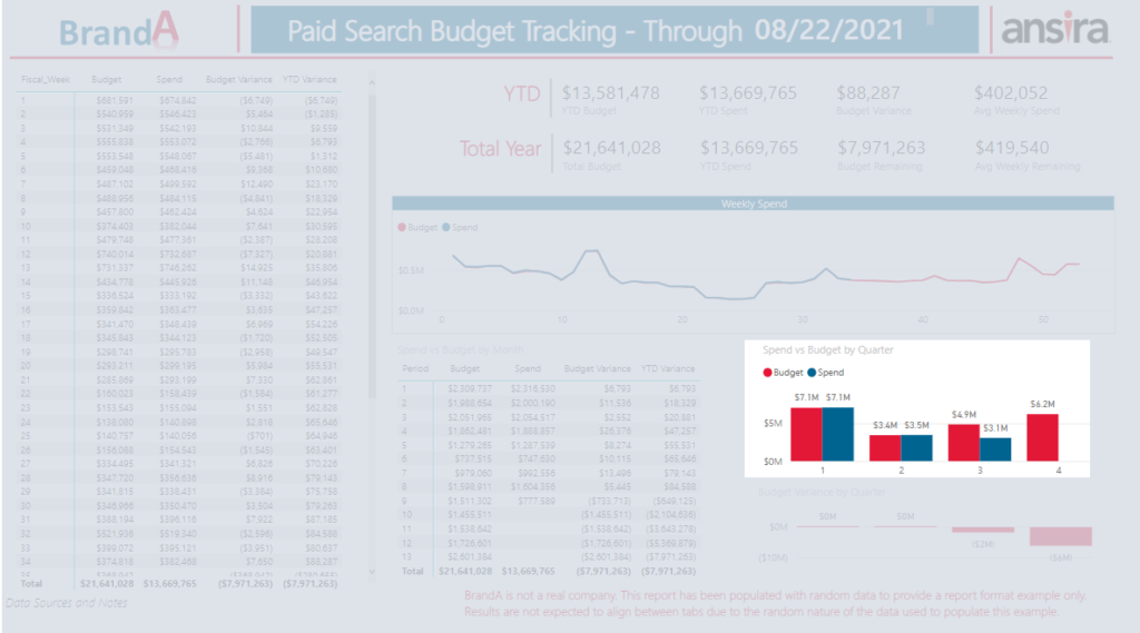
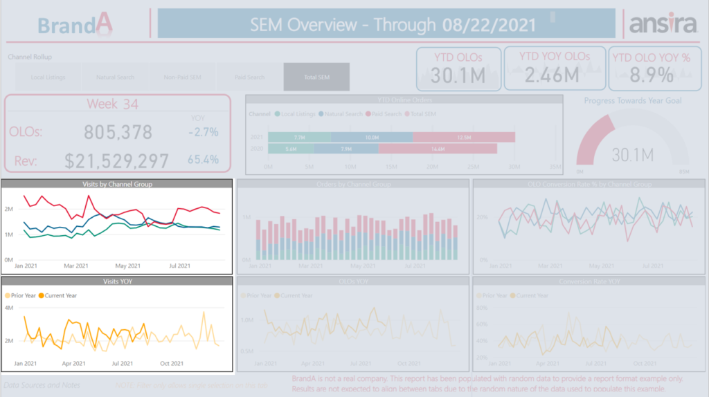
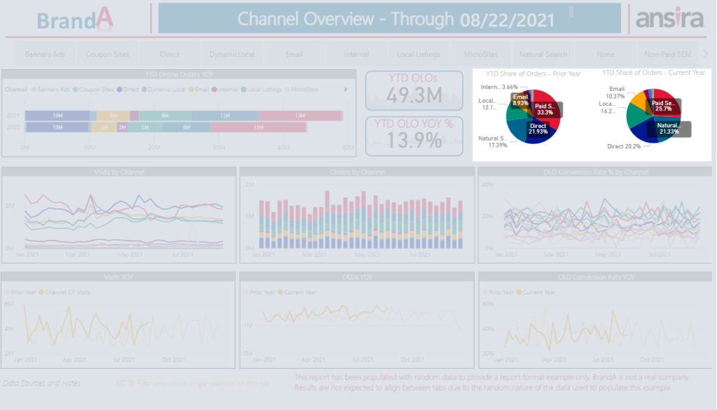
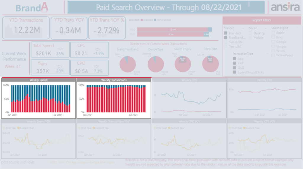
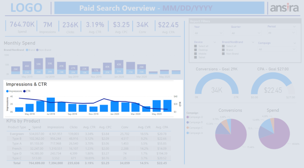
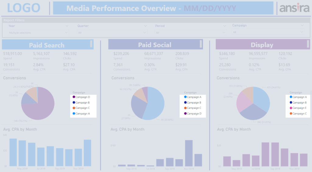
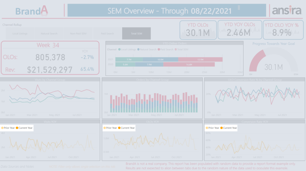
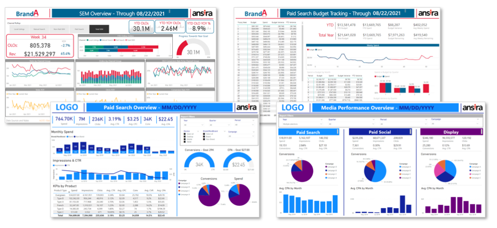
Remember when we said that beauty is in the eye of the beholder? While you may not know what your audience might consider beautiful, knowing the audience can help you determine how you should design your dashboard. Here are some examples of different dashboards that might be developed for website reporting:
2. Data Visualizations
While you can often use more than one type of visualization to present your data, here are a few best practice considerations to help you make your final selection:
Key Metric – Use to display key metric values prominently within the dashboard to draw focus to the most important numbers on the page. Limit the number of key metrics displayed as the more you include the less focus each will receive.
Dial – Use when tracking performance against a goal.
- Consider whether you want to continue to build towards a future goal or whether you want to compare where you are currently against where you would expect to be now.
Stacked Bar/Column – Use when you need to see total volume comparisons while quickly being able to understand the main contributors to the volume.
- Choosing between a Bar or Column will often come down to which fits the space better within your report.
- If you’re comparing trended dates, your better choice will almost always be columns.
- Never use a stacked chart with metrics that can’t be summed together! If your metric includes the word ‘rate’, you almost always want to avoid a stacked chart.
Clustered Bar/Column – Use when comparing more than one item or metric across categories or over time.
- Best when you are only comparing a few items.
Line Chart – Use to visualize the trend of individual items or metrics compared to each other.
- While you can include several items in a line chart, consider how useful the visual will be if you have so many lines that it’s difficult to see any of the trends.
Pie/Donut Chart – Use to visualize distribution (share) of a metric between values of the same variable.
- Limited to a single bucket of data (e.g., not for use when you want to see a trend over time).
- More than one pie/donut chart can be used side-by-side to compare two points in time, or two metrics for the same variable.
100% Stacked Bar/Column – Use when you want to compare the distribution (share) over time or across multiple categories.
Line and Column Chart – Use when you need to provide context for a trended metric or to compare two related metrics.
- For instance, your click-through-rate (CTR) will likely be impacted by your impression volume, so providing both in the same visual allows that quick reference to help explain results.
- Don’t forget to label your axes when using a dual axis chart!
3. Color
We all have color palettes we might prefer, but when deciding on colors to use in your dashboards, consider the following:
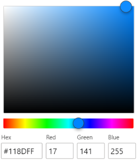
Branding – Does the company for whom the dashboard is created have specific colors that are in their brand guidelines?
- Don’t just guess at colors that look similar! Find out the RGB (Red, Green, Blue) values or the Hex code to be exact.
Consistency – Be consistent in the colors you use across visuals so that it’s easy to understand the results.
- If you have multiple visuals for different metrics comparing categories, make sure each category is represented in the same color in each of the visuals.
- If you have multiple visuals comparing YOY, be intentional in your color choices (e.g
.., prior year is always lighter shade while current year is always the darker shade).
4. Layout
You’ve spent the time considering WHAT information you should include in your dashboard and how you should present each piece of data. Now to find that optimal layout so that the end users can easily focus on the information that matters –
- Consider how your eyes focus on information laid out on a page; visual and text.
- Left to right
- Top to bottom
- Big to small
- Consider the relative importance of the different pieces of information you are including.
- The important metrics (your KPIs) should be given priority placement.
- Consider whether there is a logical flow to the information.
- Impressions > Clicks > CTR
- Sends > Opens > Open Rate > Clicks > Click Rate
- Consider how much information to include in your dashboard.
- If you include EVERY metric possible, and the layout requires the user to scroll to see everything, you likely no longer have a ‘dashboard’.
Dashboard data visualizations are the perfect opportunity to blend your analytics and creativity. Feel like you aren’t ‘creative’? Not true! If you’re an analyst, you’re using your creativity all the time to turn data into insights. Just approach your dashboard design from an analytical perspective keeping the above elements in mind and have a little fun doing it!
Our team of talented data scientists, data analysts, and data modelers are continually breaking the mold on innovative dashboards and business intelligence reporting. Contact us today if you are looking for advanced analytic segmentation, modeling, insights and dashboard reporting.