
When it comes to marketing emails, the use of images throughout an entire email is very popular and quite tempting for brands. This allows you to ensure colors (even in dark mode), as well as using any fonts, are on brand. While images are an incredibly useful tool in email and marketing campaigns, using live text in your messages is crucial to keep your emails as readable as possible. Live text isn’t only clean to the eye, it also comes with a whole host of benefits, from dark mode rendering to avoiding lawsuits.
1. Accessibility
Starting with something that is close to my heart; accessibility is crucial. It’s not just important, it’s the law. Title III of the Americans with Disabilities Act (ADA) “prohibits businesses from discriminating on the basis of disability in places of public accommodation. According to the Department of Justice, websites and mobile apps qualify as ‘places of public accommodation.’ By extension, emails may also fall under Title III of the ADA, especially when emails include exclusive discounts, pre-sale opportunities, or other perks that aren’t available elsewhere.”1
Now that we know why accessibility is important, we can dig into how live text plays its role. About 8% (nearly 20 million) of Americans have some sort of visual disability. Between robust alt text descriptions on images and live text, screen readers can accurately read the messages we are sending.
To help improve the screen reader experience, I always provide our development team with all the text broken out into sections such as H1, H2, Body, etc. Though this can’t always be used on the development side, it is helpful when able to be incorporated into the build.
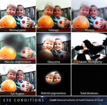
There are a wide range of visual impairments outside of total blindness. When using any kind of text or interactive element like buttons, we make sure to double check the contrast rating of the colors being used. On top of the 8% of individuals with a visual disability, another 3.7% are color blind.2 By using a contrast checker when designing, you can ensure that the text won’t get lost in the background regardless of type of colorblindness.
2) Rendering
The one major drawback of using live text is that many custom fonts will not render in all email providers. Don’t be afraid to use a custom font as long as it’s hosted on a server large enough to handle the traffic. If you are going to put the effort into picking a custom font, always put as much effort into the fall-back fonts to make sure they are as close in height, width, and style as you can. Read more here to learn about how to find email safe fonts.
Text baked into images might sound like a good alternative, but it comes with the complication of being unresponsive. An image that is made for mobile viewing will scale up and most likely become pixelated on a desktop. Images that are built for desktop resolution can be slow to load on mobile devices, or the text will be far too small to be legible.
Though there is no official font size for the ADA,4 it is a best practice to keep text above 12 pt. There is no way to guarantee text size when it is baked into an image and shrunk down to fit a mobile screen. If you do decide to use a smaller font size, many screens offer the ability to zoom in. Live text will remain crisp and easily readable when zoomed in, but many images will degrade and be too pixelated to read clearly. Using live text is the most responsive answer to many email rendering problems.
Many companies try to split the difference between embedding text into images and live text by floating live text over an image. When done well, this isn’t always a bad option, there is just a lot to keep in mind.
- If the image doesn’t render, what is the color of the background, and will that contrast well with the text?
- What is in the image, and is the text contrasted enough on top of it?
- Even if you manage to surpass these obstacles, you are then faced with the problem of dark mode inversion. When your text color gets automatically inverted (and it will), is it still accessible on this image?
Chances are, your text works well on the image in light mode, but not dark mode. You can try to hide the light mode image and show the dark mode image with custom dark mode code, but not all email providers read that. This is not an insurmountable problem, but there are so many pitfalls that I tend to avoid it in my email design systems. Stick to text without a background image.
Dark mode is becoming increasingly popular, with some sources estimating as many as 25% of email users viewing their emails in dark mode.3 Formatting text into an image that is, by default, designed for light mode can be incredibly jarring to that 25%. Using live text can solve that problem across the board. For example, Cracker Barrel had a beautiful on-brand red button they use in their emails but were shocked to find out that automatic inversion in emails changed their buttons to a bright, off-brand, bubblegum pink in dark mode.
After rigorous testing, I was able to find a dark blue button that automatically inverted to their on-brand light blue in dark mode. They have since adopted this blue button in their email communications and are incorporating their red into images instead. Even though this example dealt with their buttons, the same process is often used on live text. Taking the time to ensure your live text colors translate well into dark mode can give you the flexibility that images can’t.
Another rendering problem we often run into is that images don’t always display like you think they will. If you are putting your call to action in an image, then many customers are missing out. Even if you have rock solid alt text, there are many email providers that don’t automatically load images. Some people have images disabled on their emails to save data, and others might just be on the subway, where the emails won’t load fast enough before they get skimmed and deleted. 66% of emails are opened on mobile devices,5 and connectivity issues can impact how images load in emails. Putting the most important part of your message in live text will help the reader in any of these situations.
3) Other Advantages
By now you can understand why I am a live text advocate. I will sky write my love for live text, but there are a few more advantages that could set you up for success.
One of my favorite reasons to continue to use live text in an email is that you can personalize it. I have created email modules for Cracker Barrel that greet the customer by name. Save on Foods also used a personalized header to display their customers’ reward points. They combined this with a module that displayed which reward items were in their current points range. Personalization can go a long way in making customers feel valued and not just like one number amongst thousands.
Additional benefits include being less likely to be marked as spam and being more searchable. Search engines in an email inbox can read the live text and use that to filter searches. When it comes to spam, emails that are just one big image are more likely to be filtered into the junk folder.6
Lastly, here at Ansira, we have discovered that when you are sending a promotional email, it is crucial that the coupon code is displayed in live text. Being able to copy and paste the code means fewer hurdles for customers to go through to utilize the discount.
When it comes to brands like Raymour and Flanigan, images will always be important. Which is why, when I made their email design system, I made sure to include many modules that were more image heavy. We know that presenting their inventory is key, but with the help of my team at Ansira, we were able to find a healthy balance. Images are great, but making sure that people in all walks of life can still read and interact with your emails is better.
Sources:
- Boia.org – Do Emails Need to Be ADA Compliant?
- Colorblindguide.com – Colorblind People Population! Statistics
- Publicare.de – (Don’t) Be Afraid of the Dark
- Accessibleweb.com – Minimum font size?
- Emailmarketingplaform.com – Email Marketing Tips and Tricks: Live Text
- Email.uplers.com – Boost Deliverability With Optimal Text-To-Image Ratio In Emails