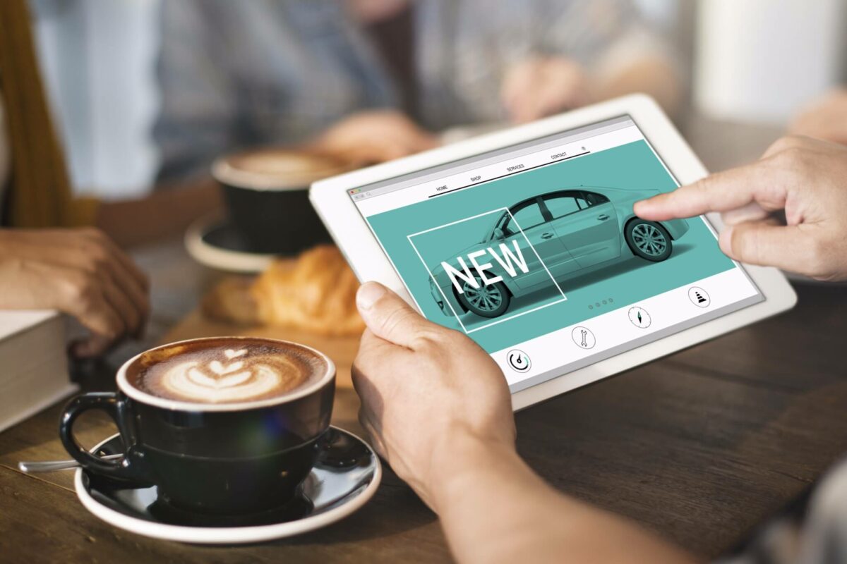
The car-buying journey is a roller coaster of emotions for most consumers, whether the decision is made for happy reasons (I got a promotion!) or sad ones (I totaled my last car). Two high points bookend the experience: a rush of excitement when the hunt begins for the one and finally holding the keys.
Before they step foot in a dealership, customers often spend a lot of time researching online. For this reason, automotive brands must ensure their websites provide seamless customer experiences. These are the top three ways automotive brands cause customers to hit the brakes.
No. 1: Failure to Prioritize Mobile
On average, more than 50% of web traffic comes from mobile devices, and this number continues to grow every year. This is why automotive brands — all brands, actually — need to prioritize the mobile experience when designing their websites. When taking a mobile-first approach, brands should consider these things:
Speed: Users are impatient, so if a website is extremely image-heavy and loads slowly, they will most likely bounce.
Simplicity: A well-designed website has a clear content hierarchy. It’s also easy to scan. Scanning is the most common way users consume content online, especially on mobile devices. If there is too much on the navigation, or too little direction, many users will leave the site due to cognitive overload.
Tap vs. Click: Mobile-first websites rely on tap elements rather than hover states. If icons are layered on top of images, the user might have to tap to display a label, then tap again to navigate to the resulting page. This may work fine on desktop, because the labels display on hover. But on mobile, it’s an impediment to the user.
Buttons and other tappable elements should be at least 40-by-40 pixels to accommodate the average thumb size. When tappable elements are too small or too close together, it’s easy to mistakenly navigate to an undesired place.
No. 2: Lack of Localization
Localization is especially important for automotive websites because it’s the first step in connecting customers with relevant dealers near them. If it’s easy for customers to access local content, then they are more likely to move down the purchasing funnel.
National sites should provide an obvious way for users to find a local dealer or view local dealer inventory. For example, within the header and the footer, a national site should provide “Find a Dealer” links that identify local sources by city or ZIP code.
No. 3: Inconsistency Between the Brand and Dealer Online Experience
After engaging with an automotive brand’s website, a user may decide to take the next step: selecting a nearby dealer. Most of the time, the user will visit one or more local dealer websites. To a customer, the brand and the dealer are one in the same, so they expect a seamless online experience, meaning the dealer website should look and function like the brand’s. Major navigational or organizational differences between the two sites can create friction or stress. They can also confuse the user enough to leave the site.
Consistency within the web ecosystem is well worth the effort, delivering greater return on investment (ROI) in the long term. A cohesive brand-to-dealer website experience removes potential roadblocks from a customer’s journey and paves the way to a purchasing decision.
Because car purchases are infrequent, automotive brands must ensure that every online interaction is productive and satisfying. By delivering a robust, personalized, global-to-local customer experience, car brands can speed past the competition — and rev up sales, too.

