In today’s digital age, website search functionality plays a pivotal role in shaping user experiences. Whether it’s finding a product, exploring content, or seeking information, users rely on search to navigate websites efficiently. But what makes a website search truly effective? To uncover the answers, let’s delve into different aspects of the search design and best practices.
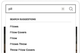
Search Suggestions: Suggested Queries in a Dropdown Menu as Users Input Text into The Search Box
Key Takeaways: Search suggestions are typically displayed below the search box and dynamically adjust as users continue typing each letter of their query. In recent times, the presence of search suggestions has become an anticipated hallmark of a finely crafted search function.

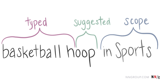
Best practice: Employ text styling to distinguish between typed query text, suggested terms, and the scope or category of each suggestion.

- If your search feature adds characters to the end of the user’s text to complete the query, emphasize these suggested characters.
- If the search feature suggests popular queries containing the user’s text anywhere in the query, highlight the user’s input.
Scoped Search: Restricting Search to a Specific Area of a Website
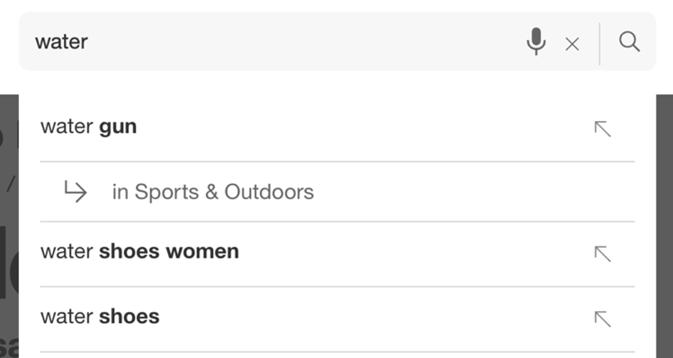
Key Takeaways: Websites adopt scoped search with the aim of expediting users’ search processes. In theory, scoped search streamlines the search experience by preemptively narrowing down options based on specified categories, thereby omitting irrelevant results and facilitating quicker access to desired information. This proactive approach is commonly realized through drop-down scope selection and autocomplete scope suggestions.


However, scoped search carries inherent risks, as users typically anticipate entering a search term and receiving relevant results from across the entire website. Because for most users, the website is viewed as a unified entity, requiring search functionality to cover all its elements. Additionally, users often ignore scope selectors due to their limited use across the web, as users are more accustomed to conducting searches that encompass the entire site. Moreover, scoped search prematurely imposes decision-making on users, increasing cognitive load by requiring category selection upfront.
Best practice: Only use the scoped search if it can be designed effectively by following these guidelines.
- Always set the default scope to ‘all’ and ensure it encompasses the entire site.
- Use strong visual cues to make scoped search apparent, such as placing the scope label near the search box and at the top of search results. Clearly state any scope limitations on the search results page and provide a one-click option to expand the search to the entire site.
- Always allow users to submit queries without specifying a scope. Set the default autocomplete suggestion without a scope, ensuring users access scoped search only when they explicitly opt for it.
Enriched Search Suggestions: Expanded Content Recommendations Related to a User’s Search Query
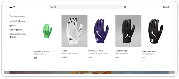
Key Takeaways: Enriched search suggestions comprise extended recommendations for website content presented to users during on-site searches, appearing below the search box as users type queries. These suggestions may encompass popular, trending, or frequently searched items, historical content such as recently searched items, and links to related product or category pages. Enriched search suggestions often incorporate both text and image formats, offering direct access to diverse content types. While some suggestions, like related product or category pages, correspond to user queries, others, such as featured items, merge search functionality with promotional endeavors.

However, users rarely engage with enriched site suggestions unless it’s executed properly. Enriched search items unrelated to the user’s query, such as trending or popular searches, fail to capture users’ interest as they typically approach site search with a focused mindset rather than an exploratory one. Users are unlikely to deviate from their specific search intent to explore new items or even notice them during search tasks. In fact, irrelevant enriched search results often cause annoyance and serve as unwanted distractions. Furthermore, enriched search results, particularly those featuring images, frequently experience delays or fail to load entirely, as users have already completed typing and submitting their query before they can be displayed.
Best practice: When integrating enriched site-search suggestions, adhere to these guidelines to ensure that this functionality aids users in their search tasks rather than obstructs them:
- Limit the amount of graphical and dynamic content, which can cause slower loading times.
- Clearly label the enriched suggestion types (e.g., top sellers, recommended products, recent searches) so that users do not have to guess what they’re seeing or why it’s being displayed.
- Create a designated area beneath the search box specifically for enriched content suggestions, rather than shifting its location based on queries.
Response time: The Duration It Takes for a System to React to Users’ Inputs
Key Takeaways: The fundamental guidance on response times has remained consistent for several decades: around 0.1 second is the threshold for users to perceive the system as reacting instantly, obviating the need for any additional feedback aside from displaying the result. Conversely, approximately 1.0 second represents the point at which the user’s train of thought can be interrupted, leading to a loss of the feeling of direct manipulation of the data.
Best practice: For website searches, swift system response within this 0.1-second limit is vital for ensuring users feel seamlessly connected to the interface.
Are you ready to elevate your website search design? Contact us today to discover how we can help you create a seamless user experience. To check out more content from Ansira related to website search, click here.

