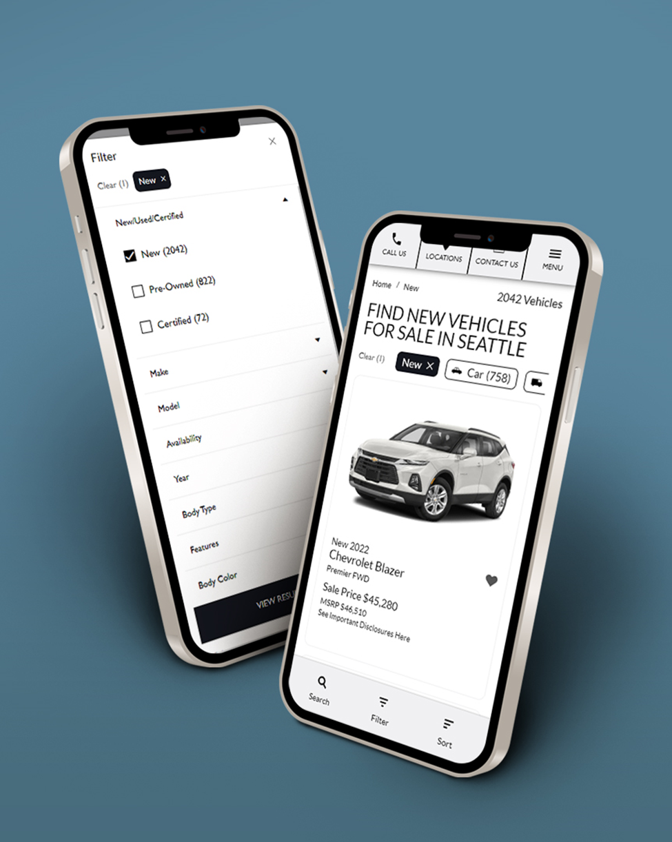
The Search Results page of a website plays a critical role in guiding shoppers to products based on their preferences. After listening to customer feedback, Ansira launched a redesign of its website platform aimed at simplifying the page’s layout and enhance its usability, ultimately resulting in increased website engagement.
CHALLENGE
The Search Results page of a website is often the first page a shopper lands on when coming from advertising or using a search engine. This page enables shoppers to find products that meet their main criteria by using tools such as filter, search and the ability to customize the sort order. Once a shopper is able to identify their available options, they can visit the Details page for more in-depth information on the product and to take the next step in the purchase process.
When looking at how our Ansira Website platform could be redesigned, we began by listening to the feedback of our existing customers. This feedback helped us to identify what was working well, and what needed improvement.
We learned that features like Filter Tags and Quick View were high performers with strong engagement metrics. We also learned that visually, the page lacked a clear content hierarchy and was overwhelming to shoppers. To address this, we identified what information is critical to shoppers at this stage in the purchase process and then created consistent styling patterns to clearly communicate the hierarchy of that information.
SOLUTION
The redesign process included analysis of retail sites commonly used for online shopping. These sites contain interface patterns that are already familiar to most shoppers. Additionally, we reviewed the websites of direct competitors to identify potential gaps as well as opportunities to gain competitive advantage. Our analysis of other websites was informed by an understanding of the different types of shoppers and their needs based on expert guidelines and best practices.
EMBRACING THE IDEA OF LESS IS MORE
Once we fully understood the needs of the shopper, identified existing pain points, and established solutions, we launched into ideation through a series of collaborative design reviews. These reviews led to the creation of a new design that fully embraces the idea of less is more. The new design displays essential information about the vehicle and page tools like filter and sort in a condensed location.
Recognizing that this new design would be a big change for our websites, we took careful steps to validate our hypothesis about what would be effective. We conducted 10 sessions of usability testing which included both mobile and desktop versions of the new design. The testing provided confirmation of many of our assumptions as well as insight into how to further improve the design.
Another form of validation was carried out with a set of beta websites. The beta websites data and metrics were carefully tracked and compared to their previous performance levels to gauge how this new design would successfully elevate performance. Results on the beta websites have been positive with a high increase in leads, increased time on site and overall, more engagement.

Beta website results:
42% Increase in overall leads
98% Increase in submission of “Get a Quote” form on Details page
25% Increase in Details page photo engagement
32% Increase in Details page similar vehicles engagement
What is most interesting, is that the highest increase in engagement is not on the redesigned page, but on the Details page. The increased engagement on the Details page is evidence that the redesigned Search Results page is doing its job. Once a shopper can identify their available options, they can visit the Details page for more in-depth information on the product and take the next step in the purchase process.
If you’re interested in learning more about Ansira’s website platform solutions, Contact us today to see how we can help enhance your online presence.

